Showing posts with label artwork. Show all posts

Saturday, February 14, 2015

Graphic Changes

I've been working with some of the graphics in the game.  Mostly pop-up windows, backgrounds and things of that nature.  I don't have a lot to say about it, so I'll just let the pictures speak for themselves and we'll see what you think.

Here's what the game looked like a week ago, when it only had the option of four characters:
The text box is somewhat transparent.

It looked okay.  The transparent text box and the dark colors were harder on the eyes than I wanted, so I knew it wasn't going to be the final version. 

I started working with some blue colors today, and this is what I came up with:
Six characters and a different color scheme.

I'm curious to know what everyone thinks about this.  So, definitely drop a comment.

Saturday, February 7, 2015

Event Text Boxes

One of the things I struggled with a lot while working on this game was how to present the event text to the player.  I tried a couple of different ways, including...

A) A style similar to the old Gold-Box games in an alternate version of the game:

Nice borders, though.


B) A "floating head style that made it seem like the NPCs were standing in the scene:

Cool head, lady.


C) A floating picture box that seemed disconnected from the text:

Weird.


I liked some of these approaches, but I started thinking of better ways to present the text to the player during the course of the game.  What I came up with won't necessarily please everyone (very few things do), but I like how everything is combined into one unit, making it easy to use and manipulate.  Here's what it looks like now:

Different.

I think it still needs some adjustment.  It isn't centered in the screen the way that I want.  Overall, though, I think it works.  Just like the bar at the bottom, it's functional rather than pretty.  It might be plain, but it works.  It offers me a way to present the player with text and images that move the story along, offer them choices and gives a sense that things are going on in the world.

Hopefully, once I've worked out the placement kinks, it will move this project one step closer to being completed.

Friday, February 6, 2015

Back From the Dead

I'm sure there were probably those out there who thought this project had died.  It's been quite some time since my last post...maybe five months or more.  And I've been really, really busy.

I decided to take a break from the project for a while.  People were giving me all sorts of "helpful" opinions on how the game should be made, and I decided it was for the best to just withdraw until that died down a bit.  Everyone thinks they know how the game should be made, but nobody is really standing in my shoes.  It gets to be kind of stressful after a while.

I had only intended to take a month or two, but with school, the holidays and a bunch of other things, I didn't return until this week.  But, the time away has given me some time to consider some changes.  When you come back after an extended leave, you tend to get a fresh perspective on your own projects.  This can help you realize what you like and what you don't like.

I decided I didn't like how cluttered the UI was.  I felt it needed some tweaking and should be made somewhat simpler.

For reference, here's what it looked like before:
Character info and buttons on the right.

It's not bad.  I wanted to squeeze a lot of information on the screen that the player could access easily.  But, as a CRPG player myself, I know that all that extra information isn't always necessary, and I can usually just access it from the character sheet. Some of it, I'm liable to remember anyway (like the character's class).

So, I went with a more common approach with the character portraits at the bottom, giving a wider angle of view at the top.  It's easier on the eyes.  In addition, I have changed the layout so that the buttons don't appear unless the player hits the ESC button.  And there are Health and Mana bars instead of numbers:

Everything at the bottom.

The UI is a bit plain at the moment, but it's also a work in progress.  I don't have any graphics to fill those spaces right now or any important information to toss in there.  So, judge it based on what it can be versus what it currently is.  Like all things in the project, it's likely to change.

Well, it's good to be back.  I look forward to sharing more updates soon.

Saturday, August 2, 2014

Handling Events

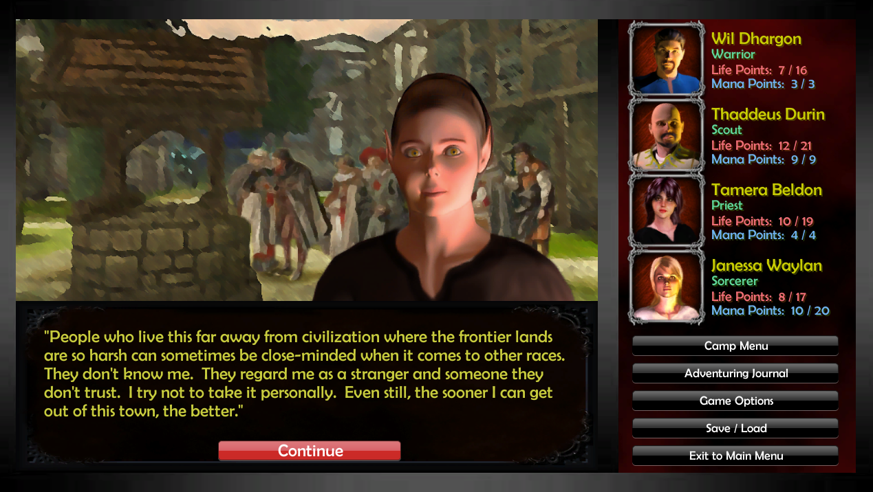
Since I have had to return to the previous version of the game (see the post just before this one about that), I had to give some thought about how events were going to be handled.  My previous approach wasn't well liked by some folks, simply because they said the graphics were too realistic to suddenly include a picture of the environment with NPCs appearing in them.

Unfortunately, that isn't likely to change.  I still can't create a game with 3D models like an expensive RPG that actually has funding.  I wish I could, but that's just not a reality when you're developing an indie RPG on a budget somewhere around $1.25.

So, my solution was to have the NPCs appear in a box with a border, so it would be obvious that they are not part of the background.  Many, many, many, many RPGs over the years have handled NPC interactions the same way...so if anyone complains about this, they'll just have to learn to live with it. 

Here's a screenshot of what I'm talking about:

It is obvious that she is not part of the background.

This puts the project back into step with the idea that it is still modeled after old-school CRPGs in style, even if it is using a modern 3D engine.  Hopefully I won't hear a lot of complaints about it.

Saturday, June 28, 2014

Triggering Events

One of the benefits of building a game for the fourth of fifth time is that you can reuse some of the code that you had previously developed.  Luckily, I had already taken time to work out a decent event system all the way back in early 2012 when the first version of the game was in development.  Transporting that into Unity turned out to be fairly simple.

So, the game now has a method by which it can trigger events.  These events can include text messages to the player, encounters with hostile creatures, ways to do damage to the party, etc.  Here's an example picture of an encounter with an angry goblin:

He looks upset.
As you can see, the game is progressing in bits and pieces.  Now that I've gone back to the original vision I had for the game, I have a clear path to get the game back to where it should be.  Instead of needing to reinvent everything, I'm finding ways to improve what I already figured out several years ago.

Once I get a couple more systems in place, I'll probably be ready to tackle the combat system again.  I've already tried it twice, but can't get it the way that I want it.  I'm sure it's just a matter of time, really.

Monday, June 9, 2014

Border Artwork

Big thanks goes to Alchemist, who provided some nice border graphics for the game.  To give you an idea of what having nice borders does for the game, here's the original graphics:

Gray borders as far as the eye can see.

And here is what the game looks like with the added borders replacing the dull gray that originally surrounded everything:

Still some gray in there, but much improved.

So, big huge thanks to Alchemist for putting in the time to make Lands of Adventure that much better. 


Friday, November 8, 2013

Graphic Update

I got some feedback regarding the screenshots I uploaded last time.  A couple of people indicated that they didn't care for the way that the graphics were done.  I had a few days to think about it and decided to approach them a different way.

For comparison, here's what the NPC interaction looked like originally:

Also pay attention to the dialogue, which changes dramatically in the next screenshot as I tightened it up somewhat.

I liked it when I first worked with it.  But, after a while, I realized it didn't sit right with me.  So, thanks to RPG Watch forum user "Sacred_Path" and a few users on RPG Codex, I got pointed in a different direction.  This is where the graphics are headed now:

A lot easier on the eyes, I think.
Anyway, feel free to leave feedback about it.  Making mistakes is just a part of the process.

Friday, November 1, 2013

Starting Town

I've reached the point in game development where I've started to throw some of the maps together.  That's because I don't know every system I'm going to need in the game until I actually build those parts of the game.  I can't guess in advance.

So, there's not really much to share in regards to features (as most of the systems behind the scenes would sound pretty boring if I described them).  However, here are some cool screenshots of the starting town...

One of the entrance gates.


Looking toward the well in the center of the town.


Near the well.

I'm fairly happy with the way it's starting to come together.  And comparing these screenshots to the early version of the game is night and day.  I'll keep you updated.

Wednesday, April 24, 2013

Screen UI Update

Two posts in one day?  I must be on a roll.

This will be a quick one, though.  I recieved some feedback about the UI.  I'm told it was a bit ugly and that the font looked too modern.  So, I've changed both.  It now looks like this:

Thanks to my wife for suggesting this.  She doesn't even play games like this.

I think I like it better than the other version.  What do you think?

Wednesday, April 10, 2013

Combat Considerations

Since I am limited on my resources, I am currently pursuing a version of combat that is similar to what appeared in the original incarnation of the game.  I would love to have a bunch of 3D models available for the player to select, but at the moment, I'm stuck with images.

The original version of combat was inspired by the old SSI game, Phantasie.  To refresh your memory, it looked like this:

The way it used to be.

An early version of the new combat screen reveals that I'm doing something similar, but with a more 3D perspective.  I'm still using the same art assets, and they work better than I thought.  The direction of the combat has changed so that the monsters are no longer on top, so I hope that it still looks good.

Take a look and see what you think:

The new way.

I'm well aware that the combat icons are repeated (it was put together as a test).  The goblins in this picture also don't mesh as well as I'd like (something else I need to fix).  Also, there's no GUI in place yet either.

I may still change it.  I haven't decided.  But, this is where it stands right now.

Monday, January 28, 2013

Storyline Progression

The demo version of "Lands of Adventure" is getting closer.  Not a day goes by where I don't fix a ton of bugs or continue working on progressing the storyline.  I will admit, though, that the demo version will only allow players to progress their characters to around level 2 (out of 10) and see only part of the overarching story.

Storyline cutscenes are fun.

While the demo will be somewhat limiting, it's my intention that the final game will provide a whole lot for a player to do.  There's still some work to be done, but honestly, things are moving along smoothly.  Maybe all the artwork isn't as perfect as I would like, but I think for the efforts of one guy in his free time, what I've done is quite impressive.

If I had some other folks programming with me or a dedicated artist or two, things would probably be moving a lot faster.  A lot of my time is taken up doing a lot of the portrait art (like in the picture above).  Thankfully, even though I modify some of the combat icon art, it was provided to me by a very talented artist via the Dungeon Craft community.

Screenshots for the sake of screenshots.

I just hope that people like what I'm doing.  So far, only two people (besides me) have seen this program in action.  One is my wife.  The other is a friend from school who happened to see it one night while we were in class.  That's not a lot of people who have been exposed to what the game is going to be like.

I really have only my own judgment, based on my experience with old-school CRPGs in my youth.  I am making the kind of game I would like to play, and that's really all I can do.  I know there have to be others who will like this style of gameplay as well.  Maybe it won't be a big audience, or maybe it will.  Hard to say right now.


Monday, January 7, 2013

Artwork and Conversations

Over the last month, I've taken to reworking much of the artwork in the game.  It's not because I was unhappy with the artwork that I had at hand, but rather because I didn't have enough of it.  So, I was forced to find other ways to come up with art.

Replicating the style of artwork I was using wasn't going to be easy.  And I need all the artwork to be similar in theme so that the game has an art style of it's own.  So, I decided upon a new style that provides me with the most flexibility and looks better.  Sadly, it abandons some of the "old-school" look that I originally wanted, but I think that it's okay to update some things.

So, take this picture (which I've shown before) of a woman being held captive by the goblins.  This is what the original screenshot looked like:

The original old-school artwork.

The updated artwork is a little more appealing, but less simple to the eye.  While I loved the simplicity of the original art (and I think the artist is brilliant), there was no way I could easily replicate his style.  So, I had to do something in my own style, which looks like this:

Updated art style.


Now, I'm sure some won't like the new style as much as the old one (and vice-versa), but it is actually easier for me to create pictures that way than attempt to match the way that the artists drew his.  I won't explain why, but anyone who is familiar with Poser 9 and Photoshop should be able to figure it out.  Despite the way some of this art looks, it's not hand painted...but the effect is nice.

Moving away from that, the other major change is that I have gone away from the old-school dialogue and conversations where you read what happens in a box at the bottom of the screen.  Whereas I loved the way that the old Gold-Box games did this (games like "Curse of the Azure Bonds" and "Pool of Radiance"), it didn't leave you a lot of options.

A woman talks at you and doesn't give you any options to respond.

Maybe it's not very old-school (and I may have to stop calling the game that now), but I would rather give a player some choices.  Later games like "Baldur's Gate" gave the player options of how to respond and what to say, sometimes allowing them to unlock information through questions that would have been force-fed to them in the old style.

So, the same encounter with the woman above now looks like this:

It's all about choices.

Whenever the player is engaged in a conversation, the main screen changes to one like this so that they can properly respond and find things out as they wish.  This means that they don't have to read everything if they don't want to.

But, another nice thing about this option is that I now have far more room for text to tell the story.  It is a less clumsy interface for reading the prose, I think.

I would love to hear what you think.  Drop me a comment.